|
Like
pieces of a puzzle
How do they all fit together in the end?
|
 |
|
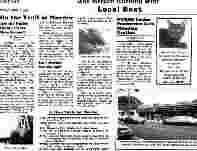
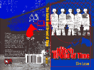
The newsprint itself not only represents Nat's profession, but provides the first and most important element of realism on the cover. The lead article is written by Ginny Chau herself, midway through the case. The small photo is of a culvert beneath the Parkway where the body was found. Other material provides local color (downtown Haworth, a tribute to the author's home town) and a touch of humor (the HAH ad).
|
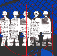
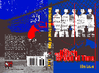
The paper dolls are the suspects, or, more accurately, a group of people without distinguishing characteristics all looking at each other. They represent the question, "Who dun it?" Perhaps Nat cut them out of the "Star" while waiting restlessly for the case to break at the beginning of Chapter Thirteen.
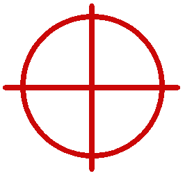
The cross-hairs play a double role, not only indicating, by pointing at one of the paper figures, that someone has been killed, but, more importantly, suggesting that one of the paper doll suspects must be singled out from the rest.
|
|
The
title graphic is both a little puzzle and a hint,
|
|
|
|
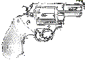
The
gun...yes
well, you did want to know it was a murder mystery, didn't you? The
graphic is of the only gun (a Colt .357 magnum) that appears in the
book...not the murder weapon.
|
|
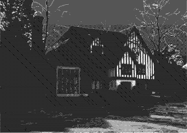
The Tudor house is, of course, Castle Dow, bastion of privilege and unhappiness. As Nat discovers, shadows fall on the well-to-do as well as those who struggle, even as they fall across this picture. Here is the untinted version of the Tudor house in all its glory. By the way, don't go looking around Bergen County trying to identify the house, because you won't find it (it's another mystery....)
|
 |
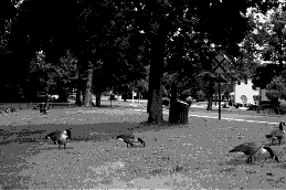 |
The
geese put into perspective the more ominous elements of the cover, reminding
us of the underlying quiet suburbia upon which the tale unfolds. For
if it is true that violence strikes even the smallest and most peaceful
community sometimes, it does not mean that smallness and peace are bad
things.
|
|
|
 |